Today, we're delighted to introduce a new and improved Community designed to enhance your Cloudera community experience.
What's New in the Community?
Here are some of the changes that we have worked on to enhance your engagement within the community:
- A Redesigned Home Page
- Updated Profile Settings
- Fresh Notifications and Message Placements, and
- Improved Navigation
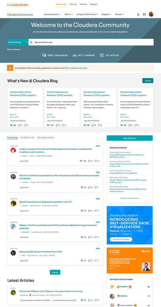
Redesigned Home Page: What to Expect
The redesigned home page is now better organized. Community questions, blogs, and articles are neatly categorized into distinct sections, resulting in faster page loading times and an enhanced browsing experience.
Account Information: Where to Find It
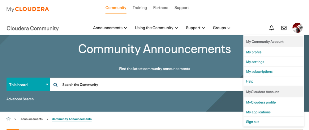
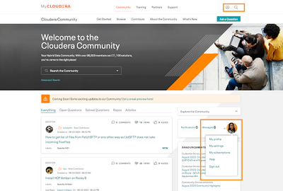
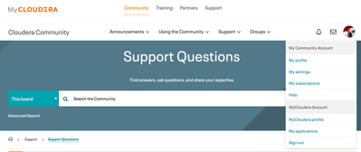
To ensure a seamless experience, we've merged the Cloudera Community and MyCloudera profiles. Both accounts can now be conveniently accessed through links located in your Profile section.
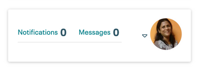
Notification System Changes: What's New
Your profile, notifications, and private message indicators have been strategically relocated to the upper right corner of the page.

Improved Site Navigation: What's Different
We've enhanced the community header to improve navigation. This includes removing the "Explore the Community" menu and introducing a new navigation menu at the top of the page. This simplifies finding categories like Announcements, Support, Using the Community, and Groups.

Differences Between the Old and New Site: A Comparison
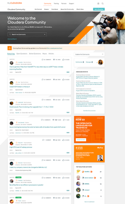
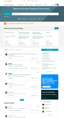
Here's a comparison table that outlines the changes across key features:
Newly redesigned home page
|
Previous Page
|
Current Page
|
|
|
Account Information
|
|
|
Notifications and Messages
|
|

|
Site Navigation
|

|

|
These changes are our commitment to providing you with a seamless and enjoyable community experience. Your insights are invaluable to us. We encourage you to share your thoughts and feedback in the comments section below the post.
Thank you for being a part of our vibrant community!
Kind regards,
Cloudera Community Team