Support Questions
- Cloudera Community
- Support
- Support Questions
- Re: Custom Axis to 30min intervals - CDP Data Viz ...
- Subscribe to RSS Feed
- Mark Question as New
- Mark Question as Read
- Float this Question for Current User
- Bookmark
- Subscribe
- Mute
- Printer Friendly Page
- Subscribe to RSS Feed
- Mark Question as New
- Mark Question as Read
- Float this Question for Current User
- Bookmark
- Subscribe
- Mute
- Printer Friendly Page
Custom Axis to 30min intervals - CDP Data Viz Public Cloud
- Labels:
-
Data Visualization
Created 08-19-2021 06:23 PM
- Mark as New
- Bookmark
- Subscribe
- Mute
- Subscribe to RSS Feed
- Permalink
- Report Inappropriate Content
Hi Team,
At the moment using CDP Data Viz Public Cloud, to visualize data using a line graph, however the axis is auto scaled. I am wanting to scale this at 30min intervals, but doesn't seem to allow me to.
Has anyone have any advice on changing the scale of the x axis to scale in 30min intervals?
Thanks
Created 08-30-2021 01:35 AM
- Mark as New
- Bookmark
- Subscribe
- Mute
- Subscribe to RSS Feed
- Permalink
- Report Inappropriate Content
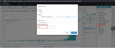
Visuals right side menu > build > Under field properties, display format
hope this helps.
Created 09-02-2021 10:18 PM
- Mark as New
- Bookmark
- Subscribe
- Mute
- Subscribe to RSS Feed
- Permalink
- Report Inappropriate Content
@Joe685, Has the reply helped resolve your issue? If so, please mark the appropriate reply as the solution, as it will make it easier for others to find the answer in the future.
Regards,
Vidya Sargur,Community Manager
Was your question answered? Make sure to mark the answer as the accepted solution.
If you find a reply useful, say thanks by clicking on the thumbs up button.
Learn more about the Cloudera Community:
Created 09-07-2021 03:31 PM
- Mark as New
- Bookmark
- Subscribe
- Mute
- Subscribe to RSS Feed
- Permalink
- Report Inappropriate Content
Thanks for the feedback, unfortunately this only provides the ability to show you what element of date/time to display. Unless I have to specify it in a special way within this field?
As an example,
Data points will be;
10.00am
10.05am
10.17am
10.32am
What I need the axis to show/plot is 10am, 10.30am, 11am and so on.....


