Community Articles
- Cloudera Community
- Support
- Community Articles
- New Visualization Feature in Hive View
- Subscribe to RSS Feed
- Mark as New
- Mark as Read
- Bookmark
- Subscribe
- Printer Friendly Page
- Report Inappropriate Content
- Subscribe to RSS Feed
- Mark as New
- Mark as Read
- Bookmark
- Subscribe
- Printer Friendly Page
- Report Inappropriate Content
Created on 11-06-2015 04:47 AM - edited 08-17-2019 01:56 PM
There are new Data Visualization, Data Explorer tabs that come part of Hive view which are really nice. I found this by accident so thought there may be others who are probably not aware of this either.
Environment details: Should work in vanilla cluster/sandbox as well but in my case the env is as below (setup using steps here😞
- Kerborized HDP 2.3.2 w/ Ranger installed
- Secure Ambari 2.1.2 (authenticating to users in IPA LDAP)
- The sample salary data from sandbox has also been imported and was used for visualization
1. After logging to Ambari 2.1.2, open the Hive view (in this case I had to create a new instance of the view configured for kerberos).
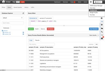
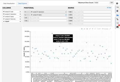
2. Click the Data Visualization tab on the right and drag/drop description and salary fields onto x, y fields
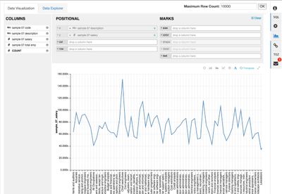
3. Select from the various chart options to change the chart
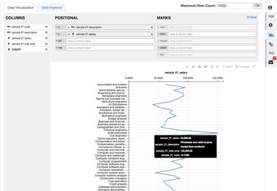
4. Click transpose button:
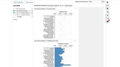
5. Navigate to Data Explorer tab to explore your data using the different fields
So all in all: visualizations look good, are responsive (at least on this dataset), and seem to work without issue on kerborized cluster!
Created on 11-06-2015 08:32 AM
- Mark as Read
- Mark as New
- Bookmark
- Permalink
- Report Inappropriate Content
Thanks for the article! Have you tested the visualization with bigger datasets as well? I am curious how the UI works with bigger datasets or queries that need some time to calculate.
Created on 11-06-2015 11:34 AM
- Mark as Read
- Mark as New
- Bookmark
- Permalink
- Report Inappropriate Content
@Randy Gelhausen @Ali Bajwa This is cool.
Created on 11-06-2015 02:56 PM
- Mark as Read
- Mark as New
- Bookmark
- Permalink
- Report Inappropriate Content
Ali, in step #2, it should read 'on the right', currently guides a reader to the left and is misleading.
Created on 11-06-2015 03:55 PM
- Mark as Read
- Mark as New
- Bookmark
- Permalink
- Report Inappropriate Content
@Andrew Grande thanks updated.
@Jonas Straub no haven't tested it on larger datasets yet - almost afraid to 😉
Created on 11-06-2015 03:55 PM
- Mark as Read
- Mark as New
- Bookmark
- Permalink
- Report Inappropriate Content
Same happened to me. I was shoing ambari views after a cluster installation to a prospect and prospect clicked on the Data Visualization tab. I said: WOW!!!! I haven't seen this before!!! Good stuff!
Created on 11-19-2015 12:30 AM
- Mark as Read
- Mark as New
- Bookmark
- Permalink
- Report Inappropriate Content
Excellent! Not only is it a great feature but it shows how quickly Ambari views are improving & adding functionality.
Created on 01-12-2016 08:14 PM
- Mark as Read
- Mark as New
- Bookmark
- Permalink
- Report Inappropriate Content
Excellent @Ali Bajwa
