We're thrilled to announce some exciting changes that we've been working on to improve your experience here. We can't wait to share them with all of you!
Here's a sneak peek at what's in store:
- A redesigned home page
- Updated profile and notification placement
- Improved navigation
Home Page Redesign
Our revamped page showcases community questions, blogs, and articles separated into distinct sections, resulting in faster page load times and improved browsing experience.
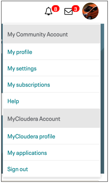
Profile And Notification Indicators
Your profile, notifications, and private message indicators have been moved to the upper right side of the page, ensuring easy access to essential account information. Additionally, we have combined the Cloudera Community and MyCloudera profiles, offering convenient access to both accounts through links available in one convenient location.
Site Navigation
To enhance site navigation, we've made significant updates to the community header. Now, you can easily find categories like Announcements, Support, Using the Community, and Groups for smoother browsing. As a part of this improvement, the "Explore the community" menu is removed:
And, a new navigation menu is introduced:
We would love to hear your thoughts about these changes! Feel free to share your feedback in the comments below.
Regards,
Cloudera Community Team!